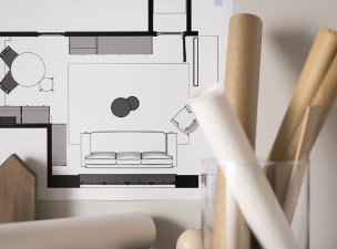
2025 Interior Design Trends You Can’t Miss
In 2025, interior design is no longer simply a battle of "decorating styles" but a deep exploration of lifestyle, technological integration, and a sustainable future.
Rustic Brown:
This Year's Key Color Trend
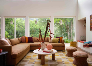
In 2025, this timeless color makes a strong comeback. Brown is seen as a key element in creating comfortable and calming spaces, reflecting our growing connection with nature and sustainable materials. Color expert Pantone's selection of "Mocha Mousse" as its 2025 Color of the Year further underscores brown's resurgence. Whether in rich, deep hues or soft, elegant shades, brown is a favorite among homeowners and interior designers for its versatility and timelessness. What better way to incorporate these earthy tones into your personal space than through the use of solid wood? This eco-friendly, organic element not only adds color but also brings life to any space.
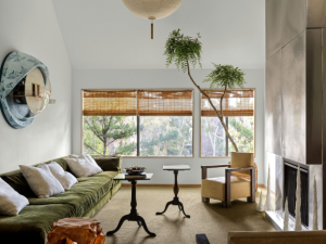
Neo-Retroism
In the fast-paced world of modern life, Generation Z's love of retro culture is quietly influencing design trends. From vintage furniture to classic patterned wallpaper, every detail exudes a nostalgic nostalgia and tribute to the past.
Design Key Points:
· Mix and Match Formula: 70% vintage base (vintage furniture, distressed materials) + 30% technological elements (smart lighting, invisible appliances).
· Material Keys: Teak, brass, velvet, and crackled glass, paired with hidden LED strips, create dramatic light and shadow effects.
· Color Scheme: Burgundy red, olive green, and amber gold, using a desaturated palette to avoid visual overload.
· Spatial Layout: Symmetrical layouts or vintage decorative lines create a rich historical charm in every corner of the home.
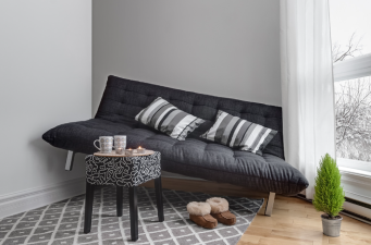
Color Therapy:
The Charm of Colorful and Personalized Design
In 2025, colorful and personalized design will become a mainstream trend in the home. Color will no longer be just an embellishment, but a core design theme.
From soft Morandi to vibrant, bright contrasts, the use of color brings both visual and emotional enjoyment.
Design Key Points:
· Matching Principles
· If you choose a Morandi color palette, use low-saturation hues like rose pink and haze blue on large soft furnishings like walls and sofas, paired with light wood furniture, to create a gentle and tranquil atmosphere.
· If you prefer vibrant contrasting colors, consider using strong contrasting combinations like yellow and blue, or red and green.
For example, a tan sofa paired with a royal blue rug, and a red and yellow abstract artwork hung on a white wall.
· Don'ts: Avoid using more than three high-saturation contrasting colors in the same space.
· Spatial Layout: Use color as an accent or a central design element, expressing your personality and taste through wall coverings, furniture, and decorative items.
· Material Selection: Opt for lustrous fabrics like velvet and satin to enhance the texture of the colors.
A New Era of Environmental Protection: Eco-Friendly Materials
With the global emphasis on environmental protection, sustainability has become a core design trend. Using eco-friendly materials in your home not only reduces environmental impact but also showcases the unique beauty of nature. Design Highlights:
· Material Selection: Furniture crafted from small wood scraps highlights the unique grain of each piece, adding a natural aging charm over time.
· Color Pairing: Earth tones such as brown, beige, and gray create a tranquil and natural atmosphere.
Spatial Layout: Emphasis is placed on natural light and the inclusion of greenery, creating a home that harmoniously coexists with nature.